In the current fast-paced digital landscape, the creation of visually appealing and responsive websites has become increasingly critical. This article examines the advantages of utilizing CSS Grid and Flexbox in WordPress theme development.
These layout techniques facilitate the design of flexible, user-friendly interfaces while simultaneously reducing code complexity and enhancing performance.
The article will provide a comprehensive guide to practical implementation steps, address common challenges, and present best practices to elevate the quality of WordPress themes.
Engaging with this content will enable you to unlock the full potential of your web designs.
Key Takeaways:
- 1 Key Takeaways:
- 2 The Benefits of Using CSS Grid and Flexbox in WordPress Theme Development
- 3 Implementing CSS Grid and Flexbox in WordPress Themes
- 4 Common Challenges and Solutions
- 5 Tips and Best Practices for Using CSS Grid and Flexbox in WordPress Themes
- 6 Frequently Asked Questions
- 6.1 What is CSS Grid and Flexbox?
- 6.2 How can I implement CSS Grid and Flexbox in WordPress themes?
- 6.3 Why should I use CSS Grid and Flexbox in WordPress theme development?
- 6.4 Are there any downsides to using CSS Grid and Flexbox?
- 6.5 Can I use CSS Grid and Flexbox together?
- 6.6 Do I need to be an expert in CSS to use CSS Grid and Flexbox in WordPress?
- CSS Grid and Flexbox make it easier to create responsive and flexible layouts for WordPress themes, improving user experience and accessibility.
- Implementing CSS Grid and Flexbox in WordPress themes requires basic setup and usage, creating grid-based layouts, and using Flexbox for content alignment and distribution.
- To overcome common challenges such as browser compatibility and nested grids, it’s important to follow best practices such as organizing and naming classes and incorporating media queries for responsive layouts.
The Benefits of Using CSS Grid and Flexbox in WordPress Theme Development
Utilizing CSS Grid and Flexbox frameworks in WordPress theme development can substantially enhance the overall user experience by providing responsive layouts and improved design flexibility.
These CSS techniques enable developers to create visually appealing and well-organized components that adapt seamlessly across various devices, thereby adopting a mobile-first approach that addresses the growing demand for responsive design.
By implementing appropriate CSS properties and rules, developers can ensure that their themes operate efficiently, reducing load times and enhancing browser compatibility. Consequently, both website administrators and visitors benefit from a streamlined and engaging interaction with the content.
Creating Responsive and Flexible Layouts
Creating responsive and flexible layouts is essential in contemporary web design, particularly for WordPress themes that must accommodate a diverse array of devices and screen sizes.
Utilizing CSS Grid and Flexbox provides designers with powerful tools for achieving this adaptability, allowing for the arrangement of elements in a manner that flows seamlessly across various viewport dimensions. By implementing these layout models, developers can create intuitive interfaces that enhance user experience and accessibility.
Media queries are instrumental in adjusting designs for different breakpoints, ensuring that content remains both readable and visually appealing. Adopting a mobile-first approach further enhances responsiveness, as it prioritizes the mobile user experience while maintaining quality on larger screens.
This strategic combination not only optimizes user engagement but also increases the overall effectiveness of the design.
Reducing Code and Improving Performance
Reducing code complexity while enhancing performance is a primary objective in WordPress theme development, where CSS Grid and Flexbox can play a pivotal role.
By utilizing these advanced layout systems, developers can achieve a more streamlined HTML structure, thereby eliminating unnecessary div wrappers and resulting in cleaner markup. This efficiency yields a significant reduction in the number of CSS rules required, facilitating easier maintenance and quicker adjustments as websites evolve.
The optimized nature of CSS Grid and Flexbox contributes to improved load times, as browsers efficiently render these modern styles. Furthermore, these systems enable responsive designs with minimal effort and enhance overall site performance, ultimately leading to an improved user experience.
Improving User Experience and Accessibility
Enhancing user experience and accessibility in WordPress themes is crucial for reaching a broader audience and ensuring equitable access to content for all users.
By integrating advanced layout techniques such as CSS Grid and Flexbox, developers can create intuitive designs that adapt seamlessly to various screen sizes and orientations. These frameworks not only simplify the process of responsive design but also significantly improve usability for users with diverse needs.
Focusing on components that are both visually appealing and functionally effective enables better alignment, spacing, and organization of content. Consequently, users benefit from clearer navigation paths and enhanced interaction possibilities, thereby fostering a more inclusive digital environment.
Implementing CSS Grid and Flexbox in WordPress Themes
Implementing CSS Grid and Flexbox in WordPress themes is a systematic process that significantly enhances both the layout and functionality of a website. This allows developers to fully utilize modern CSS capabilities.
These layout models provide versatile design solutions, facilitating the creation of responsive components that can seamlessly adapt to various screen sizes. By employing properties such as grid-template-areas, flex-direction, and justify-content, developers can design intricate and user-friendly interfaces that effectively engage visitors.
Moreover, utilizing appropriate design tools and adhering to best practices ensures that themes remain performant and robust across different browsers.
Basic Setup and Implementation
The fundamental setup and implementation of CSS Grid and Flexbox in WordPress themes necessitate a comprehensive understanding of their distinct properties and their interaction within HTML markup.
To effectively leverage these layout techniques, developers should begin by familiarizing themselves with the structure of their WordPress themes, particularly the application of containers and items. By incorporating appropriate HTML elements such as <div> and <section>, they can establish a robust foundation for layout design.
Once the markup is established, the application of CSS properties becomes imperative. For CSS Grid, properties such as display: grid, grid-template-columns, and grid-gap facilitate flexible, responsive designs. In contrast, Flexbox utilizes display: flex, flex-direction, and align-items to arrange child elements efficiently.
The integration of both techniques can produce powerful layouts that significantly enhance the user experience.
Creating Grid-based Layouts
Creating grid-based layouts using CSS Grid enables developers to structure content in a manner that is both efficient and responsive for WordPress themes.
By utilizing properties such as grid-template-columns, developers can define the number of columns and their respective sizes, ensuring that elements are aligned seamlessly across various screen sizes. The grid-gap property serves as an effective means of managing spacing between these elements, fostering a clean and organized aesthetic.
This methodology not only enhances visual appeal but also significantly improves user experience, particularly across different devices. As more users access websites through smartphones and tablets, prioritizing responsive design becomes essential for WordPress themes, as it ensures the maintenance of both functionality and aesthetics across diverse platforms.
Building flexible and responsive navigation menus is essential for enhancing user experience, and Flexbox presents an optimal solution for achieving this within WordPress themes.
By utilizing properties such as align-items and justify-content, developers can effectively create menus that adapt seamlessly to various screen sizes and resolutions. This adaptability not only enhances aesthetic appeal but also improves functionality, enabling users to navigate the website with ease.
A user-friendly design promotes engagement, making it imperative to integrate these responsive techniques with existing themes. The implementation of Flexbox facilitates smoother transitions and a more intuitive layout, ultimately encouraging users to explore the site further while preserving a cohesive brand identity.
Using Flexbox for Content Alignment and Distribution
Utilizing Flexbox for content alignment and distribution allows developers to create visually balanced and accessible layouts within WordPress themes.
By leveraging essential Flexbox properties such as flex-direction and the order property, designers can effectively manage the flow of elements within a container. The flex-direction property enables the arrangement of items in either a row or column, thereby providing flexibility in adapting designs to various screen sizes.
Employing the order property grants developers the ability to prioritize the visibility of critical content without altering the underlying HTML structure. This thoughtful manipulation enhances the coherence of the user experience, ensuring that visitors can navigate a site with ease and confidence, ultimately improving overall usability and engagement.
Combining CSS Grid and Flexbox for Complex Layouts
The integration of CSS Grid and Flexbox enables developers to address complex layouts in WordPress themes by leveraging the strengths of both CSS layout models.
By utilizing CSS Grid for the overarching structure of the page and implementing Flexbox for component-level manipulation, designers can achieve more nuanced and flexible arrangements. For instance, a portfolio grid can be established using CSS Grid to set the overall framework, facilitating responsive adjustments across various screen sizes.
Within each portfolio item, Flexbox can be employed to align images alongside text seamlessly, ensuring that the content maintains visual harmony despite variations in content length. This combination not only promotes aesthetically pleasing designs but also adheres to best practices in responsive design, where fluidity and adaptability are essential across different devices.
Common Challenges and Solutions
The implementation of CSS Grid and Flexbox in WordPress themes presents numerous advantages; however, developers frequently encounter common challenges that necessitate effective solutions to ensure optimal functionality across various environments.
Notably, browser support issues may arise, as some older browsers do not fully support newer CSS features. Additionally, managing intricate layouts with nested containers can result in unexpected behavior, requiring a careful approach to both design and coding practices.
By recognizing these prevalent challenges and applying best practices, developers can create robust themes that maintain their integrity over time.
Browser Compatibility and Fallbacks
Ensuring browser compatibility is a crucial element of web design, particularly when implementing CSS Grid and Flexbox within WordPress themes. This aspect is essential due to the fact that different web browsers interpret code in varying ways, which can result in inconsistent user experiences.
Designers should consider employing strategies such as CSS fallbacks or alternative styling methods for older browsers that may not fully support these modern layout modules. By utilizing techniques like feature queries or graceful degradation, they can create a seamless experience across various platforms.
Furthermore, employing tools such as Autoprefixer can enhance the process by automatically adding the necessary vendor prefixes to CSS properties. This practice significantly improves the accessibility and usability of web projects for all users, irrespective of their browser preferences.
Dealing with Nested Grids and Flexbox
Managing nested grids and Flexbox layouts can introduce complexities in design; however, a thorough understanding of their properties can help mitigate these challenges.
By mastering various CSS properties, such as ‘grid-template-areas’, ‘align-items’, and ‘flex-direction’, designers can create sophisticated and responsive layouts. For instance, when organizing elements within a nested grid, establishing explicit grid rows and columns can facilitate a more natural flow of content, even when accommodating varying screen sizes.
Conversely, leveraging the capabilities of Flexbox allows for more fluid adaptations, enabling items to resize and rearrange seamlessly. The incorporation of media queries further enhances responsiveness, ensuring that the design remains user-friendly across different devices.
This strategic approach not only simplifies the development process but also significantly improves the overall user experience.
Debugging and Troubleshooting Common Issues
Debugging and troubleshooting common issues in CSS Grid and Flexbox layouts are essential for maintaining the integrity of WordPress themes. Effective techniques can significantly enhance both the user experience and the visual appeal of a website.
When encountering layout problems, the initial step is to inspect elements using browser developer tools. These tools allow one to ascertain how CSS properties, such as ‘display’, ‘grid-template-rows’, and ‘flex-direction’, are being applied. Adjusting these properties in real-time can assist in identifying the root cause of misalignments.
Utilizing tools like ‘outline’ and ‘box-shadow’ is beneficial for visualizing the structural dimensions of elements. Additionally, it is prudent to examine specificity conflicts in selectors, as these can lead to unexpected behaviors within the layout.
Tips and Best Practices for Using CSS Grid and Flexbox in WordPress Themes
The implementation of CSS Grid and Flexbox in WordPress themes can be significantly enhanced by adhering to specific tips and best practices, thereby improving both efficiency and effectiveness in design.
Organizing and Naming Grid and Flexbox Classes
Organizing and adhering to naming conventions for Grid and Flexbox classes is essential for maintaining clean and manageable code within WordPress themes.
A lack of a strategic approach may result in developers encountering a complex array of confusing styles, creating significant maintenance challenges. Implementing the BEM (Block Element Modifier) methodology can greatly improve the clarity of the naming process by providing a structured format that facilitates easy identification of components.
Utilizing meaningful names that accurately describe the purpose or function of a class fosters improved collaboration among team members. Consistency is paramount; following a predefined pattern not only enhances the readability of the stylesheet but also streamlines debugging tasks, ensuring that the design remains cohesive and adaptable across various screen sizes.
Using Media Queries for Responsive Layouts
Utilizing media queries is fundamental for the development of responsive layouts, enabling developers to adjust styles according to varying screen sizes within WordPress themes.
By leveraging media queries, developers can establish specific breakpoints that activate changes in the layout, thereby ensuring a seamless user experience across all devices. This technique integrates effectively with CSS Grid and Flexbox, both of which facilitate flexible and dynamic content arrangements.
For instance, by employing a CSS Grid layout, developers can define columns and rows that adapt as the viewport changes, while Flexbox allows for the adjustment of item alignment and order based on the available space. The combination of these methodologies not only enhances the visual appeal of a website but also significantly improves usability, making it imperative for contemporary web development.
Incorporating CSS Grid and Flexbox into Existing Themes
Incorporating CSS Grid and Flexbox into existing WordPress themes can significantly enhance their layout capabilities and modernize their overall design.
By leveraging these powerful CSS frameworks, developers can streamline the process of creating responsive and adaptive layouts that are visually appealing on any device. When integrating CSS Grid and Flexbox into pre-built themes, it is essential to maintain design consistency to uphold the visual integrity and user experience of the site.
This can be achieved by carefully selecting breakpoints and layout configurations that align with the original theme’s aesthetics. Ensuring that responsive behaviors are consistent across various screen sizes will not only elevate the design but also improve user engagement and accessibility.
Frequently Asked Questions
What is CSS Grid and Flexbox?
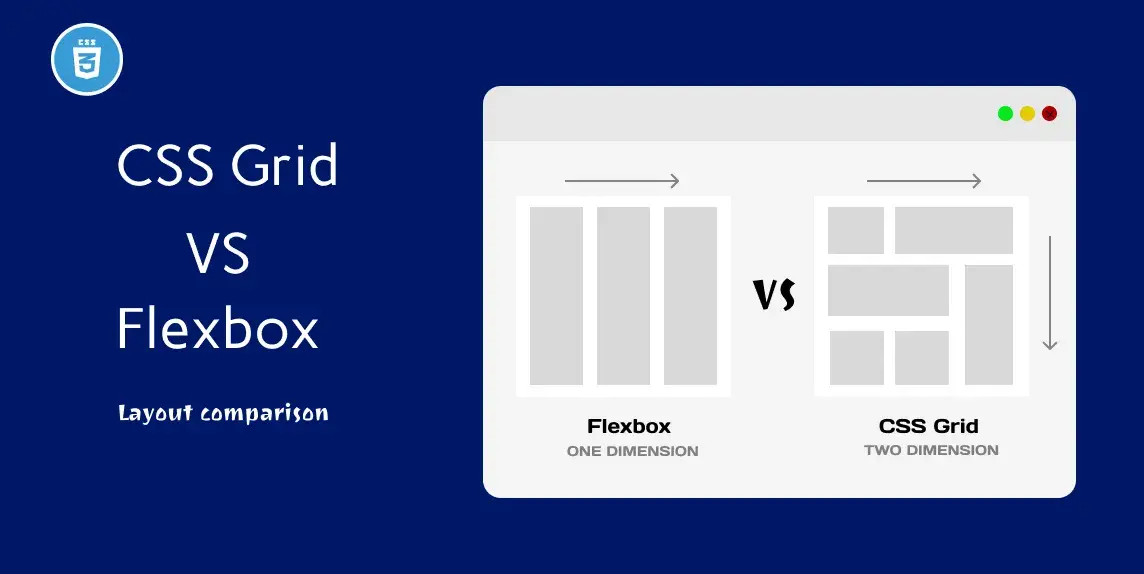
CSS Grid and Flexbox are two modern layout techniques in web design that allow developers to create flexible, responsive layouts for websites. They are essential tools for creating modern, visually appealing websites.
How can I implement CSS Grid and Flexbox in WordPress themes?
To implement CSS Grid and Flexbox in WordPress themes, you can either use a pre-made theme that already has these techniques built in, or you can manually add the necessary code to your theme’s CSS file.
Why should I use CSS Grid and Flexbox in WordPress theme development?
CSS Grid and Flexbox offer a variety of benefits for WordPress theme development, such as improved responsiveness, more control over layout and positioning, and easier maintenance of code.
Are there any downsides to using CSS Grid and Flexbox?
While CSS Grid and Flexbox are powerful tools, they may not be supported by all browsers. It’s important to test your website on different browsers to ensure it displays correctly for all users.
Can I use CSS Grid and Flexbox together?
Absolutely! In fact, combining CSS Grid and Flexbox can give you even more control and flexibility over your layout. It’s a great way to create complex, modern designs in WordPress.
Do I need to be an expert in CSS to use CSS Grid and Flexbox in WordPress?
While some knowledge of CSS is helpful, you don’t need to be an expert to use CSS Grid and Flexbox in WordPress. There are plenty of resources and tutorials available online to help you learn and implement these techniques in your theme development.
