Dark Mode Design has emerged as a prominent trend in digital aesthetics, particularly within WordPress themes.
Due to its streamlined appearance and significant advantages for user experience, numerous website creators are keen to explore this feature.
This article outlines the benefits of dark mode and offers practical techniques for its implementation, ensuring optimal readability while enhancing aesthetic quality.
Whether one opts for a plugin or custom CSS, valuable insights are provided to enhance WordPress design.
Key Takeaways:
- 1 Key Takeaways:
- 2 What is Dark Mode Design?
- 3 How to Implement Dark Mode in WordPress Themes?
- 4 Ensuring Readability in Dark Mode Design
- 5 Aesthetic Quality in Dark Mode Design
- 6 Best Practices for Dark Mode Design in WordPress Themes
- 7 Frequently Asked Questions
- 7.1 1. What is dark mode design in WordPress themes?
- 7.2 2. How can I implement dark mode in my WordPress theme?
- 7.3 3. Will using dark mode affect the readability of my website?
- 7.4 4. How can I ensure the aesthetic quality of my dark mode design?
- 7.5 5. Are there any accessibility concerns with using dark mode in WordPress?
- 7.6 6. Can I customize my dark mode design for different devices?
– Using a dark mode plugin or custom CSS are two effective ways to implement dark mode in WordPress themes.
– To ensure readability, selecting appropriate color contrast, dark theme for text and images, and proper typography are crucial elements.
– For a visually appealing dark mode design, incorporating consistent color palettes, dark mode elements, and balancing dark and light elements are key.
What is Dark Mode Design?
Dark Mode Design is a visual presentation style employed in websites and applications that incorporates a dark background color, typically utilizing light-on-dark color schemes. This approach is intended to enhance user experience and mitigate eyestrain, particularly in low-light environments.
Its popularity has increased among users due to its effectiveness in reducing blue light exposure. Furthermore, Dark Mode Design offers a contemporary aesthetic that aligns with emotional branding strategies and incorporates accessibility features.
What Are the Benefits of Dark Mode Design?
The advantages of Dark Mode Design are numerous, providing substantial benefits such as relief from eyestrain, improved battery life on OLED screens, and an enhanced user experience, particularly for individuals who spend considerable time interacting with visual content. Research indicates that dark mode can effectively reduce blue light exposure, making it an important feature for accessibility in web design.
Studies have shown that users frequently report experiencing less visual fatigue and greater comfort when utilizing dark mode during nighttime usage. Prominent platforms like Twitter and YouTube have successfully integrated dark mode options, thereby significantly improving user satisfaction.
Furthermore, dark mode can lead to increased battery longevity on devices featuring OLED technology, as individual pixels displayed in black do not consume any power. A study conducted by Android Developers underscored that this feature not only conserves energy but also aligns with contemporary trends in user experience, enhancing the enjoyment of digital environments.
With a greater emphasis on analytics, organizations can evaluate engagement metrics associated with dark mode usage, thereby informing subsequent enhancements that cater to user preferences.
How to Implement Dark Mode in WordPress Themes?
The implementation of Dark Mode in WordPress themes can significantly enhance user engagement. This can be achieved through several methods, including the use of a dark mode plugin such as WP Dark Mode, adjusting settings via the customizer, or writing custom CSS to modify the website’s color scheme.
Each of these approaches facilitates the integration of a dark color palette and provides a user-friendly dark mode toggle that can adapt to individual user preferences.
1. Using a Dark Mode Plugin
Utilizing a dark mode plugin such as WP Dark Mode represents one of the most effective methods for implementing dark mode on a WordPress site. This solution facilitates easy installation and configuration, thereby enhancing user experience while ensuring compatibility across Android, iOS, and desktop platforms.
This plugin not only provides a straightforward toggle switch for users to customize their viewing preferences but also offers adjustable settings, including contrast levels and background colors, to accommodate individual preferences.
Upon installation, website owners may opt to activate automatic switching based on the user’s system preferences, thereby creating a seamless transition between light and dark modes.
Additionally, the plugin features advanced analytics capabilities that track user engagement and preferences, yielding insights into which settings are most favored. This information enables webmasters to continually refine the user experience.
Adopting dark mode not only helps in reducing eye strain but also enhances the overall aesthetics of the site, making it a valuable enhancement for any WordPress platform.
2. Using Custom CSS
Utilizing custom CSS to implement dark mode enables website designers to exercise complete control over the visual presentation. This approach facilitates the creation of a tailored dark color palette that ensures optimal color contrast and readability, particularly with light-colored text against dark backgrounds.
This meticulous strategy is essential, as users often seek a seamless experience that minimizes eye strain during nighttime browsing. Plus color choices, it is imperative to pay attention to typography; selecting fonts that maintain legibility in low-light conditions is vital. For instance, pairing soft white text (#FFFFFF) with a deep charcoal background (#121212) can significantly enhance readability.
Maintaining a cohesive visual hierarchy is also crucial. Employing varying shades, such as medium gray (#B0B0B0) for secondary text, ensures clear distinctions and guides the user’s eye naturally through the content.
Ensuring Readability in Dark Mode Design
Ensuring readability in Dark Mode Design is essential for user engagement and satisfaction. This necessitates careful consideration of color contrast, typography, and the effective use of negative space to maintain usability.
A well-designed dark theme achieves a balance between background color and text color, facilitating a clear visual hierarchy and enhancing the overall user experience.
1. Choosing the Right Color Contrast
Selecting the appropriate color contrast between background and text colors is crucial in dark mode design, as it significantly impacts readability and user comfort while consuming visual content and navigating the website.
Developers and designers must recognize that inadequate contrast can lead to eye strain and potential accessibility issues, making it challenging for certain users to engage with the content effectively. By adhering to the Web Content Accessibility Guidelines (WCAG), they can ensure that the contrast ratio between text and background colors meets the recommended levels, typically a ratio of at least 4.5:1 for standard text.
In the process of selecting color palettes, it is important to consider hues that not only complement each other but also maintain clear legibility. Tools such as the Color Contrast Checker or Adobe Color can assist in evaluating contrast ratios, thereby contributing to the creation of an inclusive user experience that accommodates all users, including those with visual impairments.
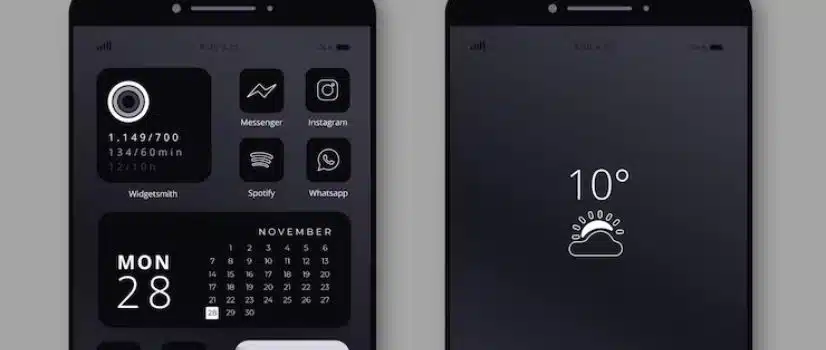
2. Using a Dark Theme for Text and Images
The adoption of a dark theme for text and images not only enhances usability but also aligns with contemporary design aesthetics, facilitating striking visual content that supports emotional branding and user engagement.
This approach cultivates a distinctive atmosphere, often evoking sophistication and modernity, thereby capturing users’ attention. When implemented effectively, dark themes can accentuate images and convey deeper emotional narratives, as exemplified by popular platforms such as Instagram and Spotify, where users are attracted to vivid visuals that stand out against a darker backdrop.
Design considerations, including contrast, color balance, and readability, are essential when creating these immersive experiences. For instance, incorporating bright accent colors can elevate specific elements, directing user focus while maintaining a cohesive overall appearance that resonates with the brand’s identity.
3. Using Proper Typography
Implementing appropriate typography in dark mode is essential for ensuring readability and enhancing the overall user experience. This may include features such as a font size toggle to accommodate various user preferences.
The selection of suitable font styles can significantly influence how content is perceived against dark backgrounds, with sans-serif fonts generally providing clearer legibility. It is important to consider utilizing lighter weights and slightly increased font sizes to improve readability, along with maintaining generous line heights to facilitate a better reading flow.
Moreover, incorporating sufficient contrast between text and background colors is crucial; employing a subtle hue can help mitigate eye strain. Adhering to these best practices can enhance accessibility, allowing a broader audience to engage comfortably with content presented in dark mode.
Aesthetic Quality in Dark Mode Design
Achieving aesthetic quality in Dark Mode Design requires a meticulous selection of a consistent color palette and the integration of dark mode elements that not only enhance visual appeal but also promote usability and improve the overall user experience.
This approach fosters a visually engaging interface that distinguishes itself within the extensive variety of website designs.
1. Using a Consistent Color Palette
Utilizing a consistent color palette in dark mode is essential for establishing a cohesive design language that enhances visual hierarchy and reinforces emotional branding.
By maintaining a harmonious blend of colors, users are more likely to engage with the interface meaningfully, as it reduces cognitive load and allows the content to take precedence. For example, pairing deep blues with soft grays can create a tranquil atmosphere, while accents of vibrant orange can introduce energy and draw attention to key elements.
Additionally, employing muted greens alongside darker shades fosters a soothing experience, which is particularly suitable for applications centered on well-being or relaxation. Such deliberate combinations not only enhance the visual appeal of the interface but also facilitate an intuitive user journey.
2. Incorporating Dark Mode Elements into the Design
Incorporating dark mode elements into web design significantly enhances the user experience while contributing to the overall aesthetic quality. It is essential to ensure that dark user interfaces remain accessible and user-friendly across various devices.
Design elements such as high-contrast typography, color accents, and subtle textures are pivotal in making dark interfaces engaging. For example, employing lighter shades for text against a dark background minimizes eye strain and improves readability, while strategically placed accent colors effectively direct users’ attention to key features or buttons.
Prominent applications like Twitter and Slack have successfully implemented dark mode, providing users with a more comfortable environment, particularly in low-light settings. The deliberate integration of these elements not only promotes visual harmony but also accommodates individual preferences, ultimately fostering a more inclusive digital experience.
3. Balancing Dark and Light Elements
Balancing dark and light elements in design results in a visually appealing layout that not only upholds usability but also enhances emotional branding through the effective use of visual hierarchy and negative space.
This careful interplay significantly influences user perception, guiding their focus and emotions in a meaningful manner. When executed thoughtfully, such a balance can evoke feelings of calmness and sophistication, thereby encouraging users to engage more deeply with the content.
To achieve this harmony, designers should consider employing contrasting hues for text and background, ensuring both readability and aesthetic appeal. The incorporation of subtle gradients and accent colors can add depth to the design without overwhelming the viewer.
By strategically placing lighter elements in key areas, the design can effectively draw attention to the most important aspects, ultimately leading to a more satisfying user experience.
Best Practices for Dark Mode Design in WordPress Themes
Implementing best practices for dark mode design in WordPress themes is crucial for fostering an inclusive and user-friendly experience that accommodates a range of user preferences, including the availability of a light mode toggle.
Such practices prioritize accessibility and usability throughout the design process, ensuring that all users can effectively engage with the content.
1. Testing for Accessibility and Usability
Testing for accessibility and usability in dark mode design is essential to ensure that all users can effectively engage with the website. Utilizing dark mode analytics allows for the evaluation of user experience and the identification of areas for improvement.
By employing a range of methods, including user testing sessions, heatmaps, and accessibility evaluation tools, designers can accurately identify contrasting issues that may impact readability and navigation. Tools such as the Color Contrast Checker can assess text visibility against background colors, ensuring compliance with WCAG standards.
Additionally, utilizing metrics such as task completion rates and user satisfaction scores offers valuable insights into how well the dark mode aligns with user needs. Furthermore, gathering user feedback through surveys or interviews is crucial, as it highlights real-world experiences and specific challenges that may arise, ultimately leading to enhancements that foster a more inclusive design.
2. Providing an Option to Switch Back to Light Mode
Providing an option to switch back to light mode is essential for accommodating user preferences, ensuring that the dark mode toggle enhances overall usability without alienating users who prefer traditional light designs.
This flexibility not only contributes to creating a more inclusive digital environment but also promotes comfort during extended usage sessions, as some individuals may find dark themes to be straining on their eyes, particularly in well-lit spaces.
For example, platforms such as Twitter and Reddit have successfully implemented this feature, allowing users to transition between modes seamlessly, thereby accommodating varying lighting conditions and personal preferences.
By adopting such practices, designers can significantly enhance user satisfaction, ultimately resulting in a more engaging and user-friendly experience.
3. Considering User Preferences and Context
Considering user preferences and context in the design of dark mode user interfaces significantly enhances overall usability and emotional branding, providing a tailored experience that aligns with the needs and environment of the user.
By acknowledging individual habits, such as light sensitivity and the typical environments in which users operate, designers can create interfaces that not only minimize eye strain but also cultivate a deeper emotional connection. When users perceive that their needs are understood through personalized design choices, their satisfaction increases, leading to heightened engagement levels.
Contextual factors, such as the time of day or the type of content being consumed, play a critical role in how dark mode can enhance focus and reduce distractions. Ultimately, recognizing these nuances in user behavior and preferences facilitates a more inclusive and gratifying interaction, ensuring that the design serves not only a functional purpose but also enriches the overall user experience.
Frequently Asked Questions
1. What is dark mode design in WordPress themes?
Dark mode design in WordPress themes is a popular feature that allows users to switch their website’s color scheme to a dark background with light text. This not only gives the website a sleek and modern look, but it also provides a more comfortable reading experience in low light conditions.
2. How can I implement dark mode in my WordPress theme?
There are several techniques for implementing dark mode in WordPress themes. One option is to use a plugin specifically designed for dark mode, such as the WP Dark Mode plugin. Alternatively, you can manually add custom CSS code to your theme to achieve the desired dark mode effect.
3. Will using dark mode affect the readability of my website?
When implemented correctly, dark mode design in WordPress themes should not affect the readability of your website. It is important to choose a dark background color that provides enough contrast with the text color to ensure easy readability for your users.
4. How can I ensure the aesthetic quality of my dark mode design?
To ensure the aesthetic quality of your dark mode design, it is important to choose a color palette that complements your brand and website design. Avoid using harsh or overly bright colors, and instead opt for muted tones that work well with the dark background.
5. Are there any accessibility concerns with using dark mode in WordPress?
While dark mode design can be beneficial for users with light sensitivity or certain visual impairments, it is important to also consider the accessibility of your website for all users. Make sure to offer an option to switch back to a light mode for those who may have difficulty reading on a dark background.
6. Can I customize my dark mode design for different devices?
Yes, you can customize your dark mode design for different devices using CSS media queries. This allows you to create a different style sheet for different screen sizes, ensuring that your dark mode design looks great on all devices, whether it’s a desktop, tablet, or mobile phone.